my Crafty Corner

Cards and other handicrafts made by Jean Straw

Tuesday 23 August 2011

On The Move

      It is a Theme Challenge for week 29 at Less Is More, and the theme is Something That Moves. This can be interpreted as a moving component on the card or an image of something capable of movement. As you will see I have used both in my card, by stamping the image of a vintage car, and adding a Tim Holtz muse token swinging from a trinket pin.
      I stamped the image onto very smooth ivory card and embossed it with clear embossing powder. I coloured the background with cut and dry foam and several shades of distress ink, Antique Linen, Tea Dye, Aged Mahogany and Walnut Stain. I then cut it out and mounted it onto black card leaving a very small edge.Next I cut a slightly larger piece of mahogany red card and fixed it towards the top of the base card, which was made by folding some lightly mottled cream card, to make a basic A6 card.
I couldn't find a matching coloured muse token and trinket pin, so I used Terra Cotta and Expresso alcohol inks with a touch of Copper mixative to colour the token, and found it made quite a good match.I fixed it to the trinket pin with a jump ring and attached it to the bottom right hand corner of the stamped image and then fixed the whole lot to the red panel on the card.
       Thank you to everyone who left kind and useful comments here last week, I really appreciate it, and also to those who have recently joined  my little group of followers.
       I am also entering this for, Cards for Men;  Anything Goes.                                                                                        

Saturday 20 August 2011

Seaside Fun

           The theme for the St Lukes' Charity Card Challenge this month is, Oh I Do Like To Be Beside the Seaside, so it was a good opportunity to use these lovely Crafty Individuals stamps.I stamped the main image onto white card with Onyx Black Memento ink and coloured it using ColourSoft pencils, and a little Sansoda to blend the colours, and then cut it out leaving a small border.
I then ran a black ink pad round the edge for definition and mounted it on a scrap of paper coloured with, I think Wild Honey Distress Stain and a gold mica spray, (I can't remember which one,)that was left over from another project. I covered the card with Crafty Individuals backing paper and stamped the bunting at the top. I stamped it again onto some spare card and coloured the flags and cut each one out individually.I fixed the mounted image to the card just overlapping the middle flags and then fixed the coloured flags over the top with glue dots, and added a tiny red brad at each end of the string.I stamped the Seaside sentiment at the bottom left corner and added the post mark for fun as it is so close to where I live. I am also entering this card for
   Crafty Individuals Challenge; Bright and Beautiful, and
   The Stamp Man Challenge; Anything Goes in Summer Colours.                                                                    
                                                                    

Tuesday 16 August 2011

Jenny Wren


   I met up with my friend this morning and we had a little browse in the shops in town and a long chat over coffee as it was some time since we had seen each other. She gave me this lovely Joanna Sheen stamp as a belated birthday present and I was delighted as I really like the little wrens and occasionally see one in my garden. I think it is because they are so tiny in real life that makes them seem so special.


 Anyway as soon as I got home this afternoon I set about cutting out the stamps and getting them mounted onto EZmount.I couldn't wait to try it out, so straight away I stamped it onto some white card with Memento Rich Cocoa ink. I was a bit worried that I wouldn't be able to colour it very well, but set about it with my lovely ColourSoft pencils. I have to admit that I used the colour picture on the packaging as a guide for this one and when it was coloured I used some Sansodor and a paper stump to blend the colours together and then added some highlights to the berries with an Inkssential white pen. I found that I was quite happy with the result, and though I had thought this was just a practice piece, as it turned out OK I decided that I should make it into a card. First I used a Go Kreate curly square die to cut the image out and then the next larger one to cut a mount from some mauve pearlised card. I fixed a strip of Elusive Images (now Chocolate Baroque) patterned paper to left side of a 5.5" white square card, and tied some purple ribbon across the lower part. I stamped and coloured the small elements from the stamp set in the two right hand corners and then fixed the main image with foam pads overlapping the pattered paper and the ribbon.

        I am entering this in the following challenges: Delightful Challenges,Things with Wings.
                                                                           Rainbow Lady,  Stamp It
                                                                           Paper playtime, Anything Goes.
                                                                           Stampalot Challenge, Whatever You Fancy.
          

Monday 15 August 2011

Less Is More Inky Challenge

              The latest challenge at Less Is More is for a one layer card and to use ink, maybe in a new way.The technique that I have chosen to use is not new to me but it is certainly one I haven't used for a while.Mandi and Chrissies' challenges seem to inspire me to revisit some of my older stamps, and this week is no exception. I chose this ArtKure stamp and an Adirondak rainbow inkpad, Woodland, which also hasn't seen the light of day for some time.I used to use these ink pads all the time but gradually Distress Inks and others have taken over. this Woodland one was always my favourite with its shades of brown and green.I stamped the image with the said ink pad and used a water brush to blend the ink to give a water colour effect.I then added a tiny touch of distress inks in Victorian Velvet and Wild honey to give a little colour to the sky.I like the peaceful little image of this stamp but I'm not too sure about the finished card. I think it could probably do with some words but couldn't find anything I liked that was quite suitable.Let me know what you think.

Sunday 7 August 2011

Flag Colours

             Challenge 27 at Less Is More this week is to design a card using the colours in our own national flag, so I have opted for the Red,White and Blue of the Union Jack.It is not a colour combination that I like very much but I decided it was slightly better than just the Red and White of the St Georges flag.I decided to stamp this row of beach huts and tried doing it by masking off alternate huts before inking the stamp and then masking the stamped ones and fitting the blue ones in between. This didn't work very well though even with the use of a stamp positioner, so I stamped and embossed a row of huts in each colour and cut out the ones I wanted from each row.I used a piece of card cut to the length of the beach huts to add a little blue shading with a pencil on the card where the beach huts would go.I then put each of the cut out huts through a Zyron sticker maker and fixed them back in their original order onto the card. I inked the text stamp with both colours of ink and added it to bottom right hand corner.The stamps I used are Crafty Individuals, and the inks are Barn Door and Chipped Sapphire Distress Ink embossed with clear embossing powder.

Wednesday 3 August 2011

Feeling Fruity?

              Feeling Fruity is the lucky dip challenge at Less Is More this week and it prompted me to dig out this lovely pear stamp. It is one of my few wood mounted stamps that is still attached to it's wood, and I must have had it a long time as I have not bought mounted stamps for ages. I began by stamping the image with Brushed Corduroy Distress Ink, and made sure it was dry by zapping it with my heat tool.I then coloured it with Distress Inks pressed onto my craft mat and spritzed lightly with water and applied with a water brush.The colours I used are Brushed Corduroy, and Forest Moss with a touch of Victorian Velvet and a little scattered Straw for the wasp/bee? I cut it out and defined the edge with the brown ink pad.Next I cut a mat of dark green card slightly smaller than my base card ,and embossed it using a Craft Concepts embossing folder called Garden Swirls. I attached the pear image to the green mat and then fixed that to the card. I then stamped the Impression Obsession  Nature sentiment with the same brown ink and cut it out and inked the edge as before and fixed it with 1mm. foam pads so I could just overlap it onto the main image.  My apologies to Chrissy and Mandi for missing the last couple of weeks, I have been busy with other things. If you care to look at my previous post  you will see some of the reason why. Thank you for taking a look, I do appreciate your comments.

Tuesday 2 August 2011

Now For Something A Bit Different

    Today instead of showing you a card, (well I might show you a card as well ) I am showing you a cake that I made last week for my sons' wedding at the weekend. It was a basic sponge cake which is quite easy to make except that I wasn't too sure how a 12" sponge would cook, so I started off by making six 6" cakes.  Then I trimmed them and sliced them in half then sandwiched them back together with apricot jam and butter cream. I arranged it so that I had four flat bottoms at the top to make an even surface to ice, and fixed the four three layer cakes together with more butter cream. I have to say here that I am no master baker or cake decorator but I can cook a decent cake and I learnt basic decorating techniques many years ago at school, and have done a few family ones before. On this occasion I opted for the ready made icing that just has to be rolled out.

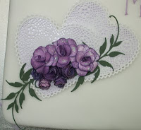
I spread a thin layer of the jam all over the cake and carefully lifted the rolled out icing onto it, then it was a case of smoothing it over and trimming the edges. I then left it to dry while I had a go at making some sugar roses, which I made a right mess of, so I decided to stick to what I do best and made a paper craft ornament instead.I looked out these two paper lace hearts that I've had for ages and layered them onto some pale lilac pearl card which I cut slightly smaller than the lace ones. I made the roses with some patterned paper and inked the edges and back with duty concord Distress ink.I made some with stamped and cut out flowers and some with a Marianne Creatables die, which cuts a spiral that you have to roll up,I find it very fiddly but they are quite effective.I also cut two leafy fronds, also a Marianne die, and layered them all together adding a little Crytsal Stickles to the roses. I fixed a piece of foil covered card to the back and attached it to the cake with some icing. I mixed a small amount of royal icing to pipe congratulations and their names with very wobbly hands. I did this first with white icing and then again over the top with lilac.
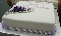
 It was neither as fine or as neat as a professional but it was reasonably presentable.Having reached the end of my patience with the piping bag I decided that I didn't want to pipe all the way around the bottom of the cake, so I coloured some of the left over roll out icing lilac and rolled it into some long strings and then did the same with some white and then twisted them together to make a rope and used it decorate the bottom edge. I then made some little organza bows to finish the corners.
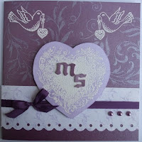
         Now just because I said I might , here is the card that I made for them. I used mauve and lilac pearlised card, and a strip of patterned pearl paper. The back ground was stamped with Brilliance Lavender, and the other images with Versamark and embossed with white powder. All the stamps are by Chocolate Baroque, the letters were cut with aTim Holtz Alterations die, once upon a time, and the scalloped edge with a Fiskars punch.The card was finished with a silk ribbon bow and some matching pearls.
        
       I should probably just add that every thing went well on the day and we all enjoyed ourselves.