my Crafty Corner

Cards and other handicrafts made by Jean Straw

Sunday 31 July 2011

Vintage ATCs

           I left it a bit late to make my ATCs for The Stamp Man swap this month, where the theme is Vintage, so I had to go for a fairly simple design and just managed to get them done in time to post before the end of the month.This is what I came up with ,and though
 I made them quite quickly I am pleased with them.
 I used the same stamp set and inks for them all which gives them a co-ordinated look. The stamps are Crafty Individuals, and the images were stamped with Memento Rich Cocoa and the shading done with Distress inks in Tea dye, Antique Linen and Aged Mahogany. I used Coloursoft pencils to add a little extra colour to the images and an Inkssential  white pen to make a lace edging on the corsets. Then I added a few ribbon, lace and button embellishments from my stash to finish them off.                                                                                                            
                                                      

Sunday 24 July 2011

Sweet Dreamer

              The Art Journey Challenge number 11 is all about children. I have several of Art Journey's children stamps, they are all lovely, but most of them have already been used in this challenge so I decided to use this one to be a bit different.  I stamped it with Memento Rich Cocoa ink and coloured it with Coloursoft pencils.  I used a Crafty Individuals Springtime backing paper and over stamped it with Bundled Sage Distress Ink and an Art Journey leafy branch, and then stuck it to a folded pale pink card.I coloured a spare piece of white card with Spun Sugar Distress stain and embossed it with Cuttlebug Swiss Dots folder. I cut a strip of this and wrapped a piece of spotted brown ribbon around it and tied it on the left hand side, before sticking to the card. I mounted the main image on foam pads on the right hand side overlapping the embossed strip, and stamped the Art Journey sentiment towards the top with the Memento ink.To finish off I took three white paper flowers and coloured them with Spun Sugar Distress Stain and Moon Glow Glitz Spritz, and when dry layered them together with a small pink flower and a brad in the centre. I cut two rose leaves with a Marianne Die and fixed them with the flower to the bottom left hand corner.
          I am also entering this card for the following challenges.
          Stamp Something: Something Embellished- Ribbon and flower.
         Crafts and Me:  Add a Flower.

Tuesday 19 July 2011

Pretty In Pink

         There is a background technique that I have been wanting to try again,( I did a very quick piece a few weeks ago for some ATCs,) since I read "how to" in an article written by Liesbeth Fidder in the March edition of Craft Stamper magazine.The article was titled Paper Blending and the technique involves tearing strips of paper and glueing them onto a piece of card and painting over with a thin coating of guesso which blends the papers together to give a kind of Shabby Chic affect.You can use patterned or printed paper, old book pages or sheet music, or paper with repeat images stamped on it. The rest of the article was about stamping a feature image onto spare card cutting it out and placing it on the background in the desired position and drawing round it with a pencil.The image is then removed and using a paper stump or a Fantastix and Black Soot Distress Ink the pencil line is covered  to create a shadow around the image when it is fixed back in place. The stamp that I have used for my card here is a bit different to the ones Liesbeth used in her feature
but this Art Journey stamp is a favourite of mine, she is such a sweet little girl and I felt that it suited my chosen colour scheme. I used a mixture of patterned and stamped paper for my background, but I think I was a little bit heavy handed with the guesso so I hope you can still see the torn strips in the photo. Once the paint was dry I cut the card to size and stamped parts of a swirly stamp around the edges with Black Soot and then Victorian Velvet Distress inks stamping  some of the ink off onto spare paper first, and then inked the edge with the Victorian Velvet.  I coloured the girl image with Coloursoft pencils before creating the shadow  effect, and fixing it to the card. I stamped the sentiment on an offcut of the paper blended card with Brilliance Lightning Black and edged with Victorian Velvet ink. I punched a small hole in each end and tied a tiny piece of ribbon through, and fixed a piece of lace along the bottom edge. I stamped two little butterflies with the same distress ink onto a scrap of pink paper and cut them out.  In my stash I had some Tim Holtz  Idea-ology Foliage pieces languishing in a box because I like having them, (and am too mean to part with them) I also have two distress embossing powders that haven't been used much. I didn't get on very well with them when I first tried them so they stayed in the drawer.The colours are Milled Lavender and Old Paper which probably matched the first Distress Inks I had.! Anyway I decided to put them together to make an embellishment. I used three different flowers and a leaf. I painted the flowers with white acrylic paint first and then sanded some of it off again, before dabbing with ink and adding the embossing powder and heating it, and then sanding lightly again.
I used both powders for a bit of contrast and was quite pleased with the result this time. I layered the pieces together and fixed the completed flower to the top left hand side with a brad, and the sentiment below it at an angle angle with double sided tape, then the two butterflies with silicon glue for  dimension.I matted the whole panel onto some Black pearly paper and then onto a  folded deeper pink pearlescent card.The background swirls and butterfly stamps are Chocolate Baroque and the sentiment is Crafty Individuals. I am entering this card for the following challenges.


                                                       The Stamp Man Fortnightly Challenge: Anything by Tim
                                                       Make My Monday: Vintage-Torn or Crumpled.(my background)
                                                       Sir Stampalot: Anything Goes
                                                       Oldie But A Goodie: Use lace and Ribbon.

Wednesday 13 July 2011

A Colour Challenge

    This months' St. Lukes' Charity Card Challenge is to make a card in back and white and one other colour.
This card started out as a one layer card showing something with legs for another challenge, hence the roundabout horse, but my first stamping of this lovely Chocolate Baroque image didn't make a very good impression, due to me using a slightly textured card not to any fault with the stamp. So rather than waste the rather nice white card I decided to add another layer and use it for this challenge instead.I stamped the horse again with Versafine Onyx Black ink onto some spare smooth white card  and onto a piece of copy paper. I carefully cut out both images, and using the paper one I used it to mask the horse on the card while I stamped the fairground image, from the same plate of stamps, so that it would appear to be behind the horse, after stamping off some of the ink on spare paper to give a lighter image adding to the sense of distance.I then used Tumbled Glass Distress ink to add colour to the horse. I dabbed the ink pad onto my craft mat and used a damp water brush to add the colour to the saddle and all the trimmings and then I spritzed the remaining ink on the mat with water to make a much lighter shade and coloured the mane and tail and added a little shading. I fixed the coloured image over the one on the card with silicon glue to give a bit of dimension, and then added the greeting at the top right hand side with the Tumbled Glass ink.To finish off I used the same ink pad to colour some white ribbon to match and tied it to the left hand side of the card.

Tuesday 12 July 2011

Dancing In Your Heart?

It is one layer card week at Less Is More and the challenge is to include something with legs. I think this dancing couple will fit the bill. I stamped the image with Versafine Vintage Sepia onto an ivory card, and then added some colour with Distress inks in Antique Linen, Aged Mahogany and Tea Dye. Then all that was left to do was to stamp the sentiment a little offset, below the dancers.Both the main image and the sentiment are Art Journey stamps.
 I see I have a few new followers this week, so welcome to you and thank you to every one who has left comments on my work, it is very encouraging.

Sunday 10 July 2011

In The Pink

   At The Stamp Man fortnightly Challenge this time the challenge is to use alcohol inks with the use of an optional sketch.I decided to try and use the sketch and chose a pink, cream and brown colour scheme so I
   could combine my project with another challenge.I started by using the alcohol inks in Pink Sherbet and Expresso to make a panel which I then cut out with a Nestabilities  scalloped rectangle and mounted it onto a pearlised brown slightly larger plain rectangle.I folded a base card in pale pink pearlised card and stuck a strip of patterned paper a little in from the left hand side, and the added a piece of pink ric-rac braid down the left of that. I used a Crafty Individual stamp and Versafine Sepia ink pad to stamp the the little girl image.I added a touch of colour with colour soft pencils and cut it out leaving a very tiny cream border.
I fixed the mounted alcohol inked panel to the card, and the stamped image on foam pads at an angle to the bottom left hand corner. This more or less followed the given sketch but because I have used a small picture the card looked unbalanced so I stamped the words Hopes and Dreams from Crafty  Individuals onto cream card and cut out with a Sissix tag die. I also cut out a leafy branch from the patterned paper with a Sissix die. I stuck the tag, together with a pink organza bow in the top right hand corner, and then arranged the patterned leaves and some tiny cream and pink ribbon roses from my stash above it.
 I am also entering this for Crafty Individuals Challenge: Pink,Cream and Brown
Joyful Stamper. Inspire Me Fridays 14: Linky Party.

Thursday 7 July 2011

Altered Beermat

Some of you may have seen the photo of my altered beermat on the Chocolate Baroque forum where we were set a little challenge by one of the members to make an altered beermat, just to make and show. Thank you to those who have left nice comments about it, and I thought some might like to see how I made it.  I have done a few before and have some nice new clean ones in my stash that my husband got for me at his bowling club.When I did them before I started by covering the mat with paper or card to give a white surface to work on, so this time I decided to try something different.I didn't really have any clear idea of what I wanted to achieve and there was no subject to stick to.I recently bought some Ranger Distress Stains and
 thought this might be a chance to try them out.
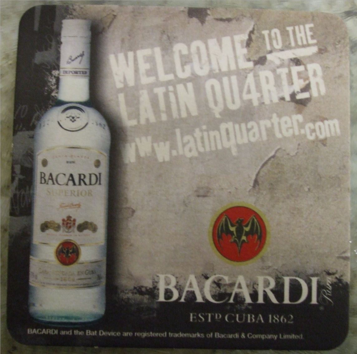
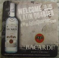
 This is the beermat I started with and I realised that the stains probably wouldn't give good coverage but decided to try it out anyway. I began with Wild Honey as it is quite a strong colour, it dried quickly and I gave it a second coat, and then went over it with a Wild Honey ink pad, but I could still see the design through it. Next I used the Forest moss Distress Stain twice I think, and by now all that showed was the little red symbol above the word Bacardi. This would be OK I thought as I would be able to cover it in some way later.By now it was a rather dark shade of brownish colour, and I think I gave it one more going over with the Wild Honey ink pad. What to do with it now? I wondered, and then decided to see if it would emboss in the Cuttlebug. I chose a  Craft Concepts folder called Venus, and I was quite surprised at how well it embossed and the beermat now looked a bit like a piece of tooled leather. Quite a good effect for some things but not really what I was looking for on this occasion. It was very dark brown so I thought I'd spray it with some gold mica mist to lighten it. I haven't used it for a while and at first it didn't want to spray properly and was just squirting drips, and then all of a sudden the spray worked and being a small piece of work it was covered in gold, and became almost too light and the effect of the embossing was almost lost. In order to make it show again I used a Vintage Photo ink pad to colour the raised areas, and to colour the edges of the mat. To make the embellishments I first chose a chipboard flourish from my stash and

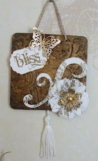
 painted it with two or three coats of white acrylic paint.By now I had decided on white and gold for decoration as the background was so dark, and also about now I remembered that I needed to include some Chocolate Baroque products in my project. I used a little fern stamp from the Teeny Weeny Meadow plate and Versamark ink to stamp on the flourish and three differently shaped white paper flowers and then embossed them with gold embossing powder. I also stamped the word Bliss from the Artistic Affirmations plate in the same way on a piece of white card and then cut it out with a small Nestabilities Labels 4 die, and edged it with a gold Krylon pen.The filigree butterfly and flower were both silver coloured embellishments in my stash and I altered their colour with the Krylon pen. The nice white tassel I used had rather a long loop so I punched a hole in center of the bottom of the mat and threaded it through from the back and hooked it over the flourish before fixing it on with diamond glaze.I punched another hole near the bottom righthand corner and layered up the flowers and fixed them with the brad in the center of the gold flower.The label and butterfly are fixed with foam pads and I made a finger cord with some white and gold crochet thread to hang it with.This piece just kind of happened as it went along, I must say it was probably not the best way to use Distress Stains, but I had fun and ended up with something I was quite pleased with.

A Touch of the Blues

It's a colour challenge for week 22 at Less Is More, the colour in question being Blue,any or many shades of Blue.I began making my card by folding a piece of navy blue card to make a side opening 43/4" square card. I then cut some bright blue card slightly smaller and die cut the corners.( Sorry I can't remember the name of the die.) Next I cut a square of very pale blue pearlescent paper and used a punch to round the corners.
I stamped the little owls and the birthday greeting with Adirondak Denim ink, and heat embossed them using clear embossing powder, and then inked the edge of the panel with Chipped Sapphire Distress Ink.I fixed the piece with die cut corners to the base card and the  stamped panel on top. As I was about to add a few light blue gem stones for a touch of bling
I realised that I had fixed the top layer on upside down.  What a pain! I decided to cut the entire front off the card and add it to a slightly larger square white card.
Here is the finished card complete with it's bling and white border!.
The stamps that I used are, the owls Chocolate Baroque, and the tiny Happy birthday is Stamp Tapestry.