my Crafty Corner

Cards and other handicrafts made by Jean Straw

Wednesday 29 June 2011

Christmas in Summer?

Anyone who knows me also knows that I don't make Christmas cards until at least October, and usually end up having to spend a couple of whole weekends at the of  November/ beginning of December making loads in a hurry in time to get them posted. However for some reason when I saw this sketch challenge at Less Is More this week, the idea for this Christmas card just popped into my head, so I thought why not?
As you can see it is quite a straight forward simple looking sketch, quite in keeping with the CAS style they like at LIM. I like traditional reds and greens in my Christmas cards so I began with a red base card. I cut a strip of gold paper to fit across, and scalloped the edges with a Fiskars punch and then fixed a strip of green card over it.I stamped the three little motifs on ivory card with Forest Moss DI and embossed with clear embossing powder. I then coloured them using more DIs and a water brush.I cut them into circles with a Nesti die and mounted them onto red scalloped circles also cut with a Nestie die.I fixed some narrow gold spotted red ribbon to each edge of the green and gold panel and stuck it in place on the card, and the added the circles on foam pads.
To finish it off  I added a stamped greeting with Versamark ink and embossed it with gold powder. My white space is not very white this week but it is space!

I am also entering this for.


Crafty Hazelnuts Christmas Challenge 26: Anything goes
Crafty Anne's Challenge Blog 42: Christmas in June

Tuesday 28 June 2011

A Happy Stamper

Last week I had a wonderful surprise when I won four plates of fabulous Chocolate  Baroque stamps which were offered as fantastic blog candy to coincide with the launch of their new stamps.They are really lovely stamps with lots of beautiful curly swirly designs, a pair of little owls, and some butterflies, and one set is of carousel horses and funfair elements.When they arrived on Friday I couldn't wait to have a play with them, but of course they needed to be cut out and mounted first so I spent the afternoon doing just that. So when Saturday afternoon came and my husband had gone out to his game of bowls I got my opportunity play.I made two cards,  one with the owls here,  the other one
 with the butterflies for my sisters' birthday this week. I started by stamping the butterflies with with a Marvy Blending Blox ink pad in shades of brown to give a variegated effect.I decided not to colour it but added some glitter to the edges of the wings with a glue pen and ultrafine glitter. Then I cut round it and trimmed the corners with a pair of corner scissors and sponged some colour from the same ink pad around the edge and matted it onto brown pearlised paper. I found some pretty Artylicious background paper and selected the area I wanted and cut it to fit my pearlised turquoise card leaving a narrow border, and then overstamped it with some of the lovely swirly, leafy parts of another stamp from the set. I fixed it to the base card and and then the butterfly panel toward the top right hand side, and added a small turquoise gemstone to three of the corners, for the forth corner I had another new product ( Kraft Glassine )that I was keen to try out. It is a coated kind of brown paper that looks waxy but is apparently not wax . It keeps it's shape when scrunched up and can be coloured with inks, sprays and Perfect Pearl mica powders which then have to be heat set and become sort of incorporated into the paper.It can also be printed in an inkjet printer and heat set in the same way. Any way because it holds it's shape it is perfect for making flowers. I cut two sizes of scalloped rounds with nestie dies, several layers, and the same with bright blue tissue paper, and then screwed them up. I coloured the kraft glassine ones with Tumbled Glass Distress Ink and some turquoise mica powder,(not actually Perfect Pearls but it must have been one one with the right kind of fixative in because it worked all right,) and heated it with my heat tool to set the colour.
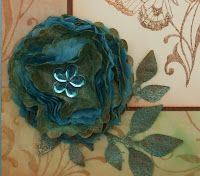
I alternated the glassine layers with the tissue paper ones and fixed them together with a flower shaped brad. I didn't have one that matched very well so I stuck this flower gem over the top. I cut the leaf  spray from kraft glassine with a Sissix die and coloured it in the same way as the flower and attached it to the remaining corner. I am entering this card in The Stamp Man Fortnightly Challenge: Butterflies and Dragonflies.

Sunday 26 June 2011

Come Fly With Me?

This is the card I made originally for the St. Lukes Charity Challenge where the theme this month is come Fly With me - anything that flies. The reason I didn't post it straight away is that while entering a different challenge I realised that that card fitted the St. Lukes theme as well so decided to enter it at the same time. So here is entry number two. My husband commented that he doubted whether this little chap with his rather fat tummy could live up to my caption of Flying High ! I think he looks pretty perky though and well able to make it.
I began by masking off a rectangle roughly in the centre of my card and colouring it with cut and dry foam and Distress inks in several shades of blue.( sorry I don't remember exactly which ones.) Then I stamped the bird and the words  with Onyx Black Versafine and used a glue pen to add some ultra fine crystal glitter to the flower trail. I think I  should have heat embossed the stamped image because the bird didn't look really black so I coloured over it with a black Marvy pen, not an ideal practice I know but I think it improved the overall appearance a bit.I just added some black gems along the bottom of the card to finish it off. The stamp I used is from an Inkadinkado set and the words from a Craft Stamper freebie. I will be sending both of my cards to St. Lukes where they will be sold to help raise funds for the St. Lukes Hospice in Sheffield. It is not a condition of entry in their challenges but it is a worthy cause if you can spare the cards.

Thursday 23 June 2011

B is for bugs, buzz and Bee

The theme this week at Less Is More is Monograms. A bit tricky I thought at first and then I remembered this stamp which I've had for a long time but haven't used lately. That seems to sound a bit familiar, but I really do have quite a lot of stamps and automatically  tend to use my latest acquisitions first. Having said that I am finding that taking part in these challenges is making me take another look at some of my older stamps which has to be a good thing. Anyway back to the Bee, I thought it might look a bit stark on white or ivory  so I decided to use this lovely yellowy cream pearlescent card. I know it looks slightly pinky on screen but in real light it is pale yellow. I stamped the Bee in Versafine Onyx Black and embossed with clear embossing powder. Just to brighten it up a bit I coloured the line around the letter and parts of the bee body with a yellow/gold sparkly gel pen. On the wings I used  sparkly blue and a clear glitter gel pens and sort blended them together. I hope this fits the bill for a monogram card. Thankyou to everyone who left comments on here last week, I really do appreciate them .
 I am also entering this card in St. Lukes' Charity Challenge. "Come Fly With Me", anything that flies.

Saturday 18 June 2011

Paris Romance

The challenge at Crafty Individuals this month is "Vintage with a Heart". I thought of this CI stamp that bears the caption Travel to Paris, but I decided to omit the words and substitute the words from another stamp plate that I have had for a long time, and I am sorry but I can't remember who made it.( I used to be not very good at keeping account of where my stamps came from.) Anyway, I stamped the main image twice with Versafine Black Onyx and embossed them with clear embossing powder.I cut the first one out and added some colour with DI in Old Paper and Tea Dye and put some lace along the bottom. The second one I coloured just the central part with pencils and cut it out and edged it with the Tea Dye ink, and fixed over the first image with 1mm foam pads. The heart stamp is one of CI little extras that usually come in their parcels. I sponged some Old Paper ink onto some spare card and then stamped the heart with Victorian Velvet ink and embossed with clear powder again. I cut it out and inked the edges with Tea Dye.I fixed it, together with a pretty heart charm from my stash, with a small brad to the lower lefthand corner of the picture. I cut a 5inch square card and covered the front with backing paper from a CI book, and attached the picture with 2mm foam pads trapping a small rosebud under the corner of  it. To finish off I stamped the words onto an offcut of backing paper and cut it into strips and inked lightly round the edges and stuck them to left of the main image, and added a decorative border from the CI paper book along the bottom.

Monday 13 June 2011

In the Frame

Week 19 at Less is More is a One Layer card, and the theme this week is to use a frame. When I came to thinking about what kind of frame I would use I remembered this stamp by Stampendous which I have had for ages and ages. I bought it because I thought it was so pretty, but I have to admit it hasn't been used a great deal. Anyway I got it out and decided that it fitted the bill and stamped it with Memento London Fog ink onto an ivory card. I then coloured it with my Colour Soft pencils, and then stamped the sentiment inside the frame. I think the word stamp is a from a Butterfly Kisses plate. A very simple card but I hope you like it.
 Thankyou to all the kind folk who have left comments on my work. I hope to get to look at more blogs this week as I have installed a new browser on the computer so hopefully I will be able to leave comments again.I managed some under anonymous last week but some I couldn't do at all.

Thursday 9 June 2011

Monochrome Rose

This is week 18 at Less is More and the challenge is Monochrome, using shades of just one colour. I decided to use one of my favourite Chocolate Baroque stamps, the script rose. I stamped it with tea dye Distress Ink and then coloured it slightly with the same ink using a water brush.My first attempt ended up looking rather wishy washy because the brush was a bit too wet. So I started again and just used clear embossing powder on the stamped image and heat set it. It didn't emboss perfectly but it set the ink enough to stop it washing out again. Having coloured it I tore all around it and inked the edges with the tea dye ink. I then mounted it on a base card to match the ink and tied it round with organza ribbon.

Tuesday 7 June 2011

A bit of Vintage

I haven't made any challenge cards to show yet this week so I thought I would show you some ATCs that I have been making instead. The theme this month for one one of the swaps I regularly take part in is embossing. No particular subject just anything, but including either dry or heat embossing. When there is no specific theme I have trouble deciding where to start!. While I was thinking about it I remembered that one day when my husband was going to be out all day, I decided that with no fixed mealtimes to worry about I could just have a fun play day. There was a technique using embossing folders and mica sprays that I had been wanting to try, so having covered the table with craft mats I had a lovely time spraying various colours onto embossed card. The mica in the spray settles into the grooves in the embossing and gives some lovely effects. I believe I learnt how to do this from a Glenda Waterworth video tutorial somewhere on the web but I'm not sure where. So, having remembered this I realised that I had a number of ready embossed backgrounds waiting to be used. I also wanted to add some heat embossing to the project so I decided to use these little frames which I bought from Crafty Individuals ages ago . They had very small circular appertures in them, so I made them a bit bigger using Nestabilities dies and coloured them with distress inks. Then I stamped and heat embossed them, some with a crackle background stamp and some with small image stamps, and used vintage images from Crafty Individuals Minatures books, People and Places 1and 2 behind them. I am afraid some of the embossing on the frames and some of the shimmer on the background doesn't show up very well in the photo. Then I just added various embellishments to finish them off. I am quite pleased with the result and glad that I found a use for my lovely shimmery pieces of card.