my Crafty Corner

Cards and other handicrafts made by Jean Straw

Thursday 29 December 2011

Butterfly Fantasy

 Hi every one, it has been ages since my last post and I must apologise to all my blog buddies for not finding time to visit your blogs and comment much lately either. I was playing catch up with christmas card making during the first half of December and that wasn't helped by having two grandaughters celebrating 21st birthdays during the first week that needed "special" cards making. In the rush to get them finished I forgot to take pictures  so I couldn't blog about them. We also had to travel north to Harrogate, ( almost 6 hour journey from here with a stop half way ) a few days before Christmas for my 18 year old grandson's passing out parade, having just graduated from the Army Foundation College there.It was a bit hectic having to travel so far just before the holiday but it was well worth it and we are all very proud of him.
 Anyway that's more than enough waffling from me so
here is a card that I have made for my daughter's
birthday which is today. I am not able to see her today as she is soaking up the sun in Lanzarote with her family, but my grandaughter has taken her cards away with her so she can open them today.I used a lilac coloured square pearl card blank and stamped the Chocolate Baroque Butterfly flourish onto creamy yellow pearl card with Memento Paris Dusk ink. I stamped the butterflies again onto a scrap of matching card and coloured them with glitter gel pens and a water brush and used an opaque white pen for the highlights, and then cut them out. I cut the yellow panel to size and decorated the edge with a Fiskars punch, and  rounded the right hand corners with a corner punch.I then attached the panel to the card and tied some matching ribbon around it. I fixed the butterflies with silicon glue so that the wings were slightly raised, and added the greeting stamped with a tapestry stamp onto a piece of lilac card. I am hoping that all the lovely shimmer in the pearl card and the glitter pens is looking really sparkly in the sunshine. Wish I was there too!!
  I am entering this at Just For Fun; Anything Goes and Rainbow Lady; Your Choice.

Thursday 24 November 2011

A Christmas Journey

It is theme week at Less Is More and the theme is Silhouettes. My first thought was to use one of my Lavinia stamps as they are mostly silhouettes, but then I found this stamp which might be a Lavinia one,  I'm really not sure as it was given to me a long time ago by my sister who found that she had two the same, and I decided to make another Christmas card. I first stamped the image onto a white
card with black ink, then I cut a scalloped circle from a piece of paper
with a nestie die and used it, with the base masked off, as a stencil to add the colour through. I used antique Linen and Stormy Sky Distress inks for  the colour, and then stamped the scripture quote underneath. I stamped a star above with Versamark and embossed with WOW Gold Glitter EP, and added a tiny yellow gem stone to the centre.
Thankyou all for your lovely comments, I appreciate them all.

Tuesday 22 November 2011

Allsorts

Today it is my husbands' birthday and every year among his gifts there is always at least one box of Licorice Allsorts as everyone in the family knows they are his favourite sweets, so when I spotted this stamp from Darkroom Door I knew that I had to get it to make his
card with. I started by stamping the sweets image onto a piece of white card with Memento tuxedo black, and then coloured it with Coloursoft pencils, trying to match the colours to the real thing. I then cut it out and mounted it onto black card leaving a small border. I stamped the base card with a swirl from a Chocolate Baroque stamp set, Nature Swirls, with Brilliance Lightning Black ink and wrapped a piece of orange ribbon across it before mounting the main image on foam pads.I stamped the sentiment that came with the sweet stamp and cut it out with a nestabillities label die.I'm not sure which one, I think it may be 16. I cut one the next size up in black to make a mount and added it to the card and finished it with tree tiny black gems on the ribbon.I kind of wish I hadn't  stamped the swirls in the background, but it had looked a bit stark without them. Hubby liked it anyway which was the reason for making it.I would like to link this to the following challenges.Anything Goes Challenge Blog.-A Real Sweetie.
                Make it Monday- 64-Anything Goes
                Sweet Stampin Challenge Blog-Birthday
                Stampin With the Dragon- Food for Thought.

Tuesday 15 November 2011

Christmas Leaves

A one layer card with leaves is required at Less Is More this week, so as I am way behind with making Christmas cards I thought I would use"Christmas leaves" on my card. I stamped the image with Versafine  Olympian Green onto a white folded card and added a little shading around it with Brilliance galaxy gold.I coloured over the berries in the centre with a Marvy pen and then used an Inkssential white pen to highlight them.I also added a very little Stickles glitter to the outer foliage, and then stamped the greeting in the bottom corner.Both the stamps are Chocolate Baroque. I have included a close up of the image to show the glitter.It is rather a nice one for Christmas called Holly, and although it is basically green it has specks of red and gold in it too.
   Thank you for taking a look, I love reading all your comments. I think I have gathered a new follower since last week too, so welcome along and I hope you continue to enjoy what you see.

Wednesday 9 November 2011

Fantastic Florals

It is a colour challenge at Less Is More this week and the colours are the colours of a bonfire, red and orange. I decided to use this image from the Chocolate Baroque plate, Fantastic Florals. I began by stamping the image onto paper and cutting out the square to use as a stencil for the back ground colouring. I positioned the stencil over my white square card slightly toward the top right hand side, and used DI in Antique Linen, Wild Honey, Spiced Marmalade, Rusty Hinge, Fired Brick and a little Aged Mahogany to fill it in. Next I removed the paper and stamped the image with Aged Mahogany over the inked background. I coloured a small piece of card to match and stamped the the butterfly corner of the stamp over it and cut out just the butterfly. I fixed this with silicon glue to raise it's wings a bit, just off the bottom left corner of the image to cover the smudge I made when trying to get the stamp in the right place.To finish the card I added an orange dotty ribbon tied down the left hand side. Thank you for taking a look, I really apreciate your comments. Jean.

I am also entering this for Stampavie and More; Anything Goes
                                and Make it Monday; Anything Goes.

Wednesday 2 November 2011

Star Shine

It's week 39 at Less Is More and the theme is Stars, so I thought it was a good opportunity to use this little Stampendous Christmas stamp  that I bought a while ago to make some of this years Christmas cards. I stamped the image and the sentiment with Memento Tuxedo Black ink, and  then used Antique Linen, Chipped Sapphire and Pumice Stone Distress inks and a water brush to add a little colour. Next I went over the stars and the sentiment with a fine glue pen and sprinkled on some glitter. The words I used are on a Chocolate Baroque Christmas theme plate, called Peace on Earth.                                                                                                                                               

I am also going to enter this for St Luke's Charity Challenge; Anything Christmassy and
Scrapbook Sister's Card Challenge; Anything Goes.

Wednesday 26 October 2011

Going Dotty?

The latest challenge from Chrissy and Mandi at Less Is More, is to use Polka Dots.
I began by sponging  Dried marigold DI through some sequin waste to create a Polka Dot  background and then stamped the Duo Design stamp over it with Sepia Versafine, and embossed it with clear embossing powder. Unfortunately I had to abandon this piece as the dots showed through the brown ink. I cut the flower out keeping the background whole and used it as a mask, placing it over the sequin waste and just inking the flower part. I then repeated the inking and embossing and this time it was OK. I cut a piece of  Dried Marigold  Core'dination card from the Distress pack and embossed it with a Cuttlebug Swiss Dots embossing folder, and lightly coloured the dots with brown ink. I fixed this to the left of a square ivory card and added some dotty ribbon. to finish I mounted the flower onto some Rusty Hinge card leaving a very narrow border and then added it to the card using foam pads.
 Thanks for looking  Jean

Monday 24 October 2011

The Stamp Man ATC

Here is the ATC that I made for The Stamp Man swap this month. The theme is Oriental which was chosen by me, but when I came to make them I was a bit stuck for ideas. I have used all my oriental stamps for swaps before at some time, and wondered what I could do different with them.In the end I decided to make three the same using one of my favourite Crafty Individuals stamps.I stamped the whole image with Onyx Black
  Versafine ink onto red card and trimmed it down a bit. Then I stamped just the right hand border onto some shiny gold paper with Black Stazon, cut it out and stuck it to the main image. Next I stamped the sentiment onto ivory card and edged it with a Krylon gold pen. I also edged the red card with the Krylon, and coloured the little fan with it. (It was silver originally) I wrapped some gold threads around just inside the border and fixed the sentiment at the bottom and the fan just above it, and mounted the whole thing on a black ATC sized card.
Thanks for taking the time to have a look. Jean.                      

Saturday 22 October 2011

Birthday Card for Kate

It was my sister Kates' birthday earlier this week and I knew that I wanted to make a card with butterflies on as they are among her favourite images. Kate makes lovely cards herself and you can see her work here, she would be happy for you to take a look.
I decided to use this Crafty Individuals
stamp,(CI175) as I have had it for a while
but not really used it. I began by stamping the whole image onto ivory card with Bundled Sage DI,  and then added some shading with Tattered Rose and Dusty Concord.Next I stamped just the butterflies onto acetate with Royal Purple Stazon and cut them out and put them through my Zyron sticker maker. I then used Oxidating Blue Art -Metal leaf to cover the adhesive, and highlighted the wing markings with an Inkssential white pen. I fixed them to the stamped panel with silicon glue and embellished the background with some pink stickles. For the main card I used a 6x6 sheet from a paper Cellar pad, Langley Place, and trimmed it slightly to fit my base card and using the same inks as before added some shading to the edges.I also used coloured pencils to pick out the flowers in the top right hand side. I fixed a piece of ribbon around the paper before fixing it to the card,and then stuck the stamped panel over the ribbon.I made a small tag and stamped it with a Tapestry Stamp to say Happy Birthday, and coloured a butterfly charm with permanent pens.To finish the card I tied a bow onto the ribbon and attached the tag and charm using a Tim Holtz Trinket Pin.
I am entering this in Crafty Individuals Monthly Challenge; Winged Things.

Thursday 20 October 2011

Joyful Greetings

I stamped this image from the new Chocolate Baroque stamp set, Peace On Earth with Onyx Black Versafine ink. I trimmed it close to the edge and coloured it with Distress Inks in, Scattered Straw, Wild Honey, Spiced Marmalade and Aged Mahogany, using cut and dry sponge, and then used coloured pencils to add a little more colour to the holly border. I printed the backing paper
from a chocolate Baroque download and cut a panel
to fit an A6 landscape card leaving just a small border. Next I edged both panels with a gold Krylon pen and mounted them onto a cream base card, and added a gold ribbon and square gems to finish it off. This a very different colour scheme to what I usually use for my Christmas cards but I was quite pleased with the result. It is also the first time that I have used this new stamp so I am entering it in ABC Christmas challenge, U for Unused, and also Whopsi Daisy Challenge, Free and Easy.  Thank you for taking a look, I appreciate all your comments.

Friday 14 October 2011

Peace and Traquility

Today I have a tag to show you. I have only made a few tags before and am still struggling a bit with the format. I began by colouring the tag all over with Paper Soft colour in Dark Sand, Lime Green and Lilac.
 This is a super medium for giving a soft blended covering. Next I embossed the   top and bottom with a Crafters Workshop template and my Cuttlebug, and then keeping the template in place I sponged more of the Lime Green colour over to emphasise the embossing. I then darkened the edge a bit with Tea Dye and then Pumice Stone DI. The centre image is a Crafty Individuals stamp that I stamped with Pumice Stone ink and coloured with Antique Linen and Tea Dye, and then cut it out and mounted it on a piece of grey pearl card. The words are from the same Crafty Individuals set. I tied some fibres to the top and added some Tim Holtz Ideaology pieces, and the little wooden bird.
I am entering  it for Try it on Tuesday; Tag-Peace and Tranquillity
and Crafty Cardmakers; Anything Goes.                                                                                  

Tuesday 11 October 2011

Heartfelt Wishes

A one layer card with a heart or hearts is the order of the day at Less Is More this week, and after making brown cards for last couple of weeks I thought I'd go pretty this time,so here is my card.
The swirly heart is a Chocolate Baroque stamp and I stamped it with
Brilliance ink pad Twilight, ( a three colour pad ) onto a white pearlecsent card. I then stamped the boating couple on top of the heart with Memento Paris Dusk ink. This is a small  Clarity stamp that I've had for ages and has been used often. I stamped the the Crafty Individuals sentiment below the main image with blue end of the Brilliance ink pad. I added some dots with white liquid pearls around the heart and sprinkled them with some crystal ultra fine glitter to add a bit of bling.
Thank you for taking a look, I appreciate your comments.

Tuesday 4 October 2011

Brown Eyes

This is the challenge set for us this week by Chrissie and Mandi at Less Is More.


Here we are again and it's time for another COLOUR challenge.

This week we have chosen

THE COLOUR OF YOUR EYES

You don't necessarily have to have an exact match, but if your eyes are blue, then any shade of blue will be fine, likewise with brown, grey, green etc.. (We aren't as mean as all that!)
However, the colour you choose should be the predominant colour on your card... we don't want to see just a hint of it.

My eyes are brown, although not quite as brown as they used to be. They seem to be turning a greyish colour as I get older just like my hair!!, but for the purpose of this challenge I am sticking with brown.


Here is the card I've made.The stamp of the woman's face is the latest Craft Stamper freebie and when I first saw it I didn't like it very much but now that I've used it I suppose that she has a bizarre kind of charm.Both the woman and the sentiment were stamped with Memento Rich Cocoa ink. The colouring was done with Distress Inks in Tea Dye, Vintage Photo and Walnut Stain, by dabbing them onto my craft mat and spritzing lightly with water and picking up with a water brush.  I embossed two lines across the lower

 part of the card to enclose the sentiment  (and so that I could try out my new Hougie board that I bought at the Ally Pally show last month), and added two brown coloured gems.

I am also entering this for ABC Challenge; Anything Goes
                                 Crafty Cardmakers; Anything Goes

Thank you for taking a look, I appreciate all your comments.Jean  


Thursday 29 September 2011

Less Is More Challenge 34

This weeks' challenge at Less Is More is a sketch, and it is a nice easy one
too. I started by cutting an A4 white sheet to make a folded 5" square card. I stamped the image onto a piece of paper and cut round the edge to make a stencil to colour through.I used Antique Linen, Tea Dye and Vintage Photo Distress inks to colour the area and then stamped the image with Walnut Stain DI., keeping the stencil in place to make sure I placed it cerrctly. The sentiment was stamped at the bottom with the same ink. Very simple but quite pleasing I think. The stamps I used are both Art Journey. Thanks again for looking, Jean
I am also entering this for Allsorts Challenge; Keep it Simple.
                                       Simon Says; Anything Goes
                                   

Monday 26 September 2011

The Stamp Man ATCs

Here are my ATCs  for The Stamp Man swap this month where the theme is "In My Garden". I wanted to do something a little bit different than flowers and insects etc., and I remembered that  I had this Crafty Individuals stamp.The words on it have always amused me and I decided it would fit in with theme. I stamped the image with Versafine  Onyx  Black ink and the trimmed the words off from the bottom. I shaded the image with  Antique Linen, Tea Dye and Aged  Mahogany Distress inks and fixed it at an angle onto some rust coloured card and then added the cut out words across the bottom corner. I layered a couple of orange flowers and and fixed them to the top right hand corner with a brown brad.
Thank you for taking a look . Jean

Thursday 22 September 2011

Blog Bus?!!

My blog appears to be like the proverbial buses at the moment, no blog for two weeks, then two in two days! I just had time to make this card today and thought I would add another little contribution towards Chrissie and Mandi's target of 1000 entries in the Less Is More challenge this week.

I stamped the text by dabbing the three different coloured ink pads onto the stamp and stamping very lightly onto waste paper to remove surplus ink and then on to ivory card. I cut this with a nestie scalloped circle die and inked the edges lightly with the rust ink pad. I stamped the leaves in the same way using the first impression of ink, and cut them out. I fixed the circle with double sided tape towards the top of a DL sized ivory card and glued the leaves on with silicon glue.

The stamps I used are old and had no name on them and I'm sorry I can't remember whose they are. The inks are Rusty Nails, Forest Moss and Vintage Photo Distress Inks.

Thank you to everyone who has left comments already on yesterdays post, all of your comments are really appreciated.

Wednesday 21 September 2011

Simply Embossed

  It has been some time since my last blog, mainly because my sister Kate was here all last week on a visit from Spain, and the week before I was preoccupied with other family stuff, so I apologise also for not visiting many blogs or leaving comments. I think I am back to normal now and my first challenge is for Less Is More, where they are aiming for 1000 entries this week. WOW!! The theme is Anything CAS Goes.
 So here is my very simple card. I used a piece of Vintage Photo coloured card from the Tim Holtz and Ranger Distress Collection of Core'diantions, and passed it through the Cuttlebug with this cute little Sissix embossing folder. I then trimmed it to the size I wanted and rounded the corners with a punch and ditressed the edges with a pair of scissors. I fixed it to an ivory base card slightly toward the top left and added a few gemstones.

I am also entering this for,
                               The Sisterhood of Crafters; For The Birds,
                               Crafty Boots; Things with Wings.
                           

Thursday 1 September 2011

Gilded Butterfly

  This weeks Less Is More challenge is a recipe-We are asked to combine three of their previous challenges.
I made this butterfly last week while showing some crafting friends how to do this technique, since when it has been floating around my work space waiting to find a suitable landing place. Today it found it's way onto my LIM card for this week. It was made by stamping the butterfly with Timber Brown Stazon onto acetate and  then placing  it onto a double sided adhesive sheet. I  then cut it out and peeled off the backing paper and covered the adhesive with Varigated Green Gilding Flakes, and burnished it to remove the excess.Today I stamped the butterfly onto a square white card, and wrapped a piece of two tone brown ribbon around, and fixed the acetate butterfly over it with silicon glue.I added three gemstones below the ribbon to finish off.
    The challenges I used are, Week 11 Acetate, Week 16 Butterfly, and Week 25 Ribbon or Buttons. The stamp I used is from Chocolate Baroque, and the gilding flakes from Crafty Notions.

Tuesday 23 August 2011

On The Move

      It is a Theme Challenge for week 29 at Less Is More, and the theme is Something That Moves. This can be interpreted as a moving component on the card or an image of something capable of movement. As you will see I have used both in my card, by stamping the image of a vintage car, and adding a Tim Holtz muse token swinging from a trinket pin.
      I stamped the image onto very smooth ivory card and embossed it with clear embossing powder. I coloured the background with cut and dry foam and several shades of distress ink, Antique Linen, Tea Dye, Aged Mahogany and Walnut Stain. I then cut it out and mounted it onto black card leaving a very small edge.Next I cut a slightly larger piece of mahogany red card and fixed it towards the top of the base card, which was made by folding some lightly mottled cream card, to make a basic A6 card.
I couldn't find a matching coloured muse token and trinket pin, so I used Terra Cotta and Expresso alcohol inks with a touch of Copper mixative to colour the token, and found it made quite a good match.I fixed it to the trinket pin with a jump ring and attached it to the bottom right hand corner of the stamped image and then fixed the whole lot to the red panel on the card.
       Thank you to everyone who left kind and useful comments here last week, I really appreciate it, and also to those who have recently joined  my little group of followers.
       I am also entering this for, Cards for Men;  Anything Goes.                                                                                        

Saturday 20 August 2011

Seaside Fun

           The theme for the St Lukes' Charity Card Challenge this month is, Oh I Do Like To Be Beside the Seaside, so it was a good opportunity to use these lovely Crafty Individuals stamps.I stamped the main image onto white card with Onyx Black Memento ink and coloured it using ColourSoft pencils, and a little Sansoda to blend the colours, and then cut it out leaving a small border.
I then ran a black ink pad round the edge for definition and mounted it on a scrap of paper coloured with, I think Wild Honey Distress Stain and a gold mica spray, (I can't remember which one,)that was left over from another project. I covered the card with Crafty Individuals backing paper and stamped the bunting at the top. I stamped it again onto some spare card and coloured the flags and cut each one out individually.I fixed the mounted image to the card just overlapping the middle flags and then fixed the coloured flags over the top with glue dots, and added a tiny red brad at each end of the string.I stamped the Seaside sentiment at the bottom left corner and added the post mark for fun as it is so close to where I live. I am also entering this card for
   Crafty Individuals Challenge; Bright and Beautiful, and
   The Stamp Man Challenge; Anything Goes in Summer Colours.                                                                    
                                                                    

Tuesday 16 August 2011

Jenny Wren


   I met up with my friend this morning and we had a little browse in the shops in town and a long chat over coffee as it was some time since we had seen each other. She gave me this lovely Joanna Sheen stamp as a belated birthday present and I was delighted as I really like the little wrens and occasionally see one in my garden. I think it is because they are so tiny in real life that makes them seem so special.


 Anyway as soon as I got home this afternoon I set about cutting out the stamps and getting them mounted onto EZmount.I couldn't wait to try it out, so straight away I stamped it onto some white card with Memento Rich Cocoa ink. I was a bit worried that I wouldn't be able to colour it very well, but set about it with my lovely ColourSoft pencils. I have to admit that I used the colour picture on the packaging as a guide for this one and when it was coloured I used some Sansodor and a paper stump to blend the colours together and then added some highlights to the berries with an Inkssential white pen. I found that I was quite happy with the result, and though I had thought this was just a practice piece, as it turned out OK I decided that I should make it into a card. First I used a Go Kreate curly square die to cut the image out and then the next larger one to cut a mount from some mauve pearlised card. I fixed a strip of Elusive Images (now Chocolate Baroque) patterned paper to left side of a 5.5" white square card, and tied some purple ribbon across the lower part. I stamped and coloured the small elements from the stamp set in the two right hand corners and then fixed the main image with foam pads overlapping the pattered paper and the ribbon.

        I am entering this in the following challenges: Delightful Challenges,Things with Wings.
                                                                           Rainbow Lady,  Stamp It
                                                                           Paper playtime, Anything Goes.
                                                                           Stampalot Challenge, Whatever You Fancy.
          

Monday 15 August 2011

Less Is More Inky Challenge

              The latest challenge at Less Is More is for a one layer card and to use ink, maybe in a new way.The technique that I have chosen to use is not new to me but it is certainly one I haven't used for a while.Mandi and Chrissies' challenges seem to inspire me to revisit some of my older stamps, and this week is no exception. I chose this ArtKure stamp and an Adirondak rainbow inkpad, Woodland, which also hasn't seen the light of day for some time.I used to use these ink pads all the time but gradually Distress Inks and others have taken over. this Woodland one was always my favourite with its shades of brown and green.I stamped the image with the said ink pad and used a water brush to blend the ink to give a water colour effect.I then added a tiny touch of distress inks in Victorian Velvet and Wild honey to give a little colour to the sky.I like the peaceful little image of this stamp but I'm not too sure about the finished card. I think it could probably do with some words but couldn't find anything I liked that was quite suitable.Let me know what you think.

Sunday 7 August 2011

Flag Colours

             Challenge 27 at Less Is More this week is to design a card using the colours in our own national flag, so I have opted for the Red,White and Blue of the Union Jack.It is not a colour combination that I like very much but I decided it was slightly better than just the Red and White of the St Georges flag.I decided to stamp this row of beach huts and tried doing it by masking off alternate huts before inking the stamp and then masking the stamped ones and fitting the blue ones in between. This didn't work very well though even with the use of a stamp positioner, so I stamped and embossed a row of huts in each colour and cut out the ones I wanted from each row.I used a piece of card cut to the length of the beach huts to add a little blue shading with a pencil on the card where the beach huts would go.I then put each of the cut out huts through a Zyron sticker maker and fixed them back in their original order onto the card. I inked the text stamp with both colours of ink and added it to bottom right hand corner.The stamps I used are Crafty Individuals, and the inks are Barn Door and Chipped Sapphire Distress Ink embossed with clear embossing powder.

Wednesday 3 August 2011

Feeling Fruity?

              Feeling Fruity is the lucky dip challenge at Less Is More this week and it prompted me to dig out this lovely pear stamp. It is one of my few wood mounted stamps that is still attached to it's wood, and I must have had it a long time as I have not bought mounted stamps for ages. I began by stamping the image with Brushed Corduroy Distress Ink, and made sure it was dry by zapping it with my heat tool.I then coloured it with Distress Inks pressed onto my craft mat and spritzed lightly with water and applied with a water brush.The colours I used are Brushed Corduroy, and Forest Moss with a touch of Victorian Velvet and a little scattered Straw for the wasp/bee? I cut it out and defined the edge with the brown ink pad.Next I cut a mat of dark green card slightly smaller than my base card ,and embossed it using a Craft Concepts embossing folder called Garden Swirls. I attached the pear image to the green mat and then fixed that to the card. I then stamped the Impression Obsession  Nature sentiment with the same brown ink and cut it out and inked the edge as before and fixed it with 1mm. foam pads so I could just overlap it onto the main image.  My apologies to Chrissy and Mandi for missing the last couple of weeks, I have been busy with other things. If you care to look at my previous post  you will see some of the reason why. Thank you for taking a look, I do appreciate your comments.

Tuesday 2 August 2011

Now For Something A Bit Different

    Today instead of showing you a card, (well I might show you a card as well ) I am showing you a cake that I made last week for my sons' wedding at the weekend. It was a basic sponge cake which is quite easy to make except that I wasn't too sure how a 12" sponge would cook, so I started off by making six 6" cakes.  Then I trimmed them and sliced them in half then sandwiched them back together with apricot jam and butter cream. I arranged it so that I had four flat bottoms at the top to make an even surface to ice, and fixed the four three layer cakes together with more butter cream. I have to say here that I am no master baker or cake decorator but I can cook a decent cake and I learnt basic decorating techniques many years ago at school, and have done a few family ones before. On this occasion I opted for the ready made icing that just has to be rolled out.

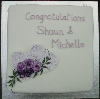
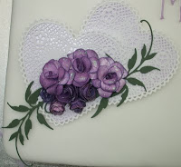
I spread a thin layer of the jam all over the cake and carefully lifted the rolled out icing onto it, then it was a case of smoothing it over and trimming the edges. I then left it to dry while I had a go at making some sugar roses, which I made a right mess of, so I decided to stick to what I do best and made a paper craft ornament instead.I looked out these two paper lace hearts that I've had for ages and layered them onto some pale lilac pearl card which I cut slightly smaller than the lace ones. I made the roses with some patterned paper and inked the edges and back with duty concord Distress ink.I made some with stamped and cut out flowers and some with a Marianne Creatables die, which cuts a spiral that you have to roll up,I find it very fiddly but they are quite effective.I also cut two leafy fronds, also a Marianne die, and layered them all together adding a little Crytsal Stickles to the roses. I fixed a piece of foil covered card to the back and attached it to the cake with some icing. I mixed a small amount of royal icing to pipe congratulations and their names with very wobbly hands. I did this first with white icing and then again over the top with lilac.

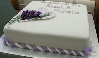
 It was neither as fine or as neat as a professional but it was reasonably presentable.Having reached the end of my patience with the piping bag I decided that I didn't want to pipe all the way around the bottom of the cake, so I coloured some of the left over roll out icing lilac and rolled it into some long strings and then did the same with some white and then twisted them together to make a rope and used it decorate the bottom edge. I then made some little organza bows to finish the corners.

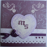
         Now just because I said I might , here is the card that I made for them. I used mauve and lilac pearlised card, and a strip of patterned pearl paper. The back ground was stamped with Brilliance Lavender, and the other images with Versamark and embossed with white powder. All the stamps are by Chocolate Baroque, the letters were cut with aTim Holtz Alterations die, once upon a time, and the scalloped edge with a Fiskars punch.The card was finished with a silk ribbon bow and some matching pearls.
        
       I should probably just add that every thing went well on the day and we all enjoyed ourselves.

Sunday 31 July 2011

Vintage ATCs

           I left it a bit late to make my ATCs for The Stamp Man swap this month, where the theme is Vintage, so I had to go for a fairly simple design and just managed to get them done in time to post before the end of the month.This is what I came up with ,and though
 I made them quite quickly I am pleased with them.
 I used the same stamp set and inks for them all which gives them a co-ordinated look. The stamps are Crafty Individuals, and the images were stamped with Memento Rich Cocoa and the shading done with Distress inks in Tea dye, Antique Linen and Aged Mahogany. I used Coloursoft pencils to add a little extra colour to the images and an Inkssential  white pen to make a lace edging on the corsets. Then I added a few ribbon, lace and button embellishments from my stash to finish them off.                                                                                                            
                                                      

Sunday 24 July 2011

Sweet Dreamer

              The Art Journey Challenge number 11 is all about children. I have several of Art Journey's children stamps, they are all lovely, but most of them have already been used in this challenge so I decided to use this one to be a bit different.  I stamped it with Memento Rich Cocoa ink and coloured it with Coloursoft pencils.  I used a Crafty Individuals Springtime backing paper and over stamped it with Bundled Sage Distress Ink and an Art Journey leafy branch, and then stuck it to a folded pale pink card.I coloured a spare piece of white card with Spun Sugar Distress stain and embossed it with Cuttlebug Swiss Dots folder. I cut a strip of this and wrapped a piece of spotted brown ribbon around it and tied it on the left hand side, before sticking to the card. I mounted the main image on foam pads on the right hand side overlapping the embossed strip, and stamped the Art Journey sentiment towards the top with the Memento ink.To finish off I took three white paper flowers and coloured them with Spun Sugar Distress Stain and Moon Glow Glitz Spritz, and when dry layered them together with a small pink flower and a brad in the centre. I cut two rose leaves with a Marianne Die and fixed them with the flower to the bottom left hand corner.
          I am also entering this card for the following challenges.
          Stamp Something: Something Embellished- Ribbon and flower.
         Crafts and Me:  Add a Flower.

Tuesday 19 July 2011

Pretty In Pink

         There is a background technique that I have been wanting to try again,( I did a very quick piece a few weeks ago for some ATCs,) since I read "how to" in an article written by Liesbeth Fidder in the March edition of Craft Stamper magazine.The article was titled Paper Blending and the technique involves tearing strips of paper and glueing them onto a piece of card and painting over with a thin coating of guesso which blends the papers together to give a kind of Shabby Chic affect.You can use patterned or printed paper, old book pages or sheet music, or paper with repeat images stamped on it. The rest of the article was about stamping a feature image onto spare card cutting it out and placing it on the background in the desired position and drawing round it with a pencil.The image is then removed and using a paper stump or a Fantastix and Black Soot Distress Ink the pencil line is covered  to create a shadow around the image when it is fixed back in place. The stamp that I have used for my card here is a bit different to the ones Liesbeth used in her feature
but this Art Journey stamp is a favourite of mine, she is such a sweet little girl and I felt that it suited my chosen colour scheme. I used a mixture of patterned and stamped paper for my background, but I think I was a little bit heavy handed with the guesso so I hope you can still see the torn strips in the photo. Once the paint was dry I cut the card to size and stamped parts of a swirly stamp around the edges with Black Soot and then Victorian Velvet Distress inks stamping  some of the ink off onto spare paper first, and then inked the edge with the Victorian Velvet.  I coloured the girl image with Coloursoft pencils before creating the shadow  effect, and fixing it to the card. I stamped the sentiment on an offcut of the paper blended card with Brilliance Lightning Black and edged with Victorian Velvet ink. I punched a small hole in each end and tied a tiny piece of ribbon through, and fixed a piece of lace along the bottom edge. I stamped two little butterflies with the same distress ink onto a scrap of pink paper and cut them out.  In my stash I had some Tim Holtz  Idea-ology Foliage pieces languishing in a box because I like having them, (and am too mean to part with them) I also have two distress embossing powders that haven't been used much. I didn't get on very well with them when I first tried them so they stayed in the drawer.The colours are Milled Lavender and Old Paper which probably matched the first Distress Inks I had.! Anyway I decided to put them together to make an embellishment. I used three different flowers and a leaf. I painted the flowers with white acrylic paint first and then sanded some of it off again, before dabbing with ink and adding the embossing powder and heating it, and then sanding lightly again.
I used both powders for a bit of contrast and was quite pleased with the result this time. I layered the pieces together and fixed the completed flower to the top left hand side with a brad, and the sentiment below it at an angle angle with double sided tape, then the two butterflies with silicon glue for  dimension.I matted the whole panel onto some Black pearly paper and then onto a  folded deeper pink pearlescent card.The background swirls and butterfly stamps are Chocolate Baroque and the sentiment is Crafty Individuals. I am entering this card for the following challenges.


                                                       The Stamp Man Fortnightly Challenge: Anything by Tim
                                                       Make My Monday: Vintage-Torn or Crumpled.(my background)
                                                       Sir Stampalot: Anything Goes
                                                       Oldie But A Goodie: Use lace and Ribbon.

Wednesday 13 July 2011

A Colour Challenge

    This months' St. Lukes' Charity Card Challenge is to make a card in back and white and one other colour.
This card started out as a one layer card showing something with legs for another challenge, hence the roundabout horse, but my first stamping of this lovely Chocolate Baroque image didn't make a very good impression, due to me using a slightly textured card not to any fault with the stamp. So rather than waste the rather nice white card I decided to add another layer and use it for this challenge instead.I stamped the horse again with Versafine Onyx Black ink onto some spare smooth white card  and onto a piece of copy paper. I carefully cut out both images, and using the paper one I used it to mask the horse on the card while I stamped the fairground image, from the same plate of stamps, so that it would appear to be behind the horse, after stamping off some of the ink on spare paper to give a lighter image adding to the sense of distance.I then used Tumbled Glass Distress ink to add colour to the horse. I dabbed the ink pad onto my craft mat and used a damp water brush to add the colour to the saddle and all the trimmings and then I spritzed the remaining ink on the mat with water to make a much lighter shade and coloured the mane and tail and added a little shading. I fixed the coloured image over the one on the card with silicon glue to give a bit of dimension, and then added the greeting at the top right hand side with the Tumbled Glass ink.To finish off I used the same ink pad to colour some white ribbon to match and tied it to the left hand side of the card.

Tuesday 12 July 2011

Dancing In Your Heart?

It is one layer card week at Less Is More and the challenge is to include something with legs. I think this dancing couple will fit the bill. I stamped the image with Versafine Vintage Sepia onto an ivory card, and then added some colour with Distress inks in Antique Linen, Aged Mahogany and Tea Dye. Then all that was left to do was to stamp the sentiment a little offset, below the dancers.Both the main image and the sentiment are Art Journey stamps.
 I see I have a few new followers this week, so welcome to you and thank you to every one who has left comments on my work, it is very encouraging.

Sunday 10 July 2011

In The Pink

   At The Stamp Man fortnightly Challenge this time the challenge is to use alcohol inks with the use of an optional sketch.I decided to try and use the sketch and chose a pink, cream and brown colour scheme so I
   could combine my project with another challenge.I started by using the alcohol inks in Pink Sherbet and Expresso to make a panel which I then cut out with a Nestabilities  scalloped rectangle and mounted it onto a pearlised brown slightly larger plain rectangle.I folded a base card in pale pink pearlised card and stuck a strip of patterned paper a little in from the left hand side, and the added a piece of pink ric-rac braid down the left of that. I used a Crafty Individual stamp and Versafine Sepia ink pad to stamp the the little girl image.I added a touch of colour with colour soft pencils and cut it out leaving a very tiny cream border.
I fixed the mounted alcohol inked panel to the card, and the stamped image on foam pads at an angle to the bottom left hand corner. This more or less followed the given sketch but because I have used a small picture the card looked unbalanced so I stamped the words Hopes and Dreams from Crafty  Individuals onto cream card and cut out with a Sissix tag die. I also cut out a leafy branch from the patterned paper with a Sissix die. I stuck the tag, together with a pink organza bow in the top right hand corner, and then arranged the patterned leaves and some tiny cream and pink ribbon roses from my stash above it.
 I am also entering this for Crafty Individuals Challenge: Pink,Cream and Brown
Joyful Stamper. Inspire Me Fridays 14: Linky Party.

Thursday 7 July 2011

Altered Beermat

Some of you may have seen the photo of my altered beermat on the Chocolate Baroque forum where we were set a little challenge by one of the members to make an altered beermat, just to make and show. Thank you to those who have left nice comments about it, and I thought some might like to see how I made it.  I have done a few before and have some nice new clean ones in my stash that my husband got for me at his bowling club.When I did them before I started by covering the mat with paper or card to give a white surface to work on, so this time I decided to try something different.I didn't really have any clear idea of what I wanted to achieve and there was no subject to stick to.I recently bought some Ranger Distress Stains and
 thought this might be a chance to try them out.
 This is the beermat I started with and I realised that the stains probably wouldn't give good coverage but decided to try it out anyway. I began with Wild Honey as it is quite a strong colour, it dried quickly and I gave it a second coat, and then went over it with a Wild Honey ink pad, but I could still see the design through it. Next I used the Forest moss Distress Stain twice I think, and by now all that showed was the little red symbol above the word Bacardi. This would be OK I thought as I would be able to cover it in some way later.By now it was a rather dark shade of brownish colour, and I think I gave it one more going over with the Wild Honey ink pad. What to do with it now? I wondered, and then decided to see if it would emboss in the Cuttlebug. I chose a  Craft Concepts folder called Venus, and I was quite surprised at how well it embossed and the beermat now looked a bit like a piece of tooled leather. Quite a good effect for some things but not really what I was looking for on this occasion. It was very dark brown so I thought I'd spray it with some gold mica mist to lighten it. I haven't used it for a while and at first it didn't want to spray properly and was just squirting drips, and then all of a sudden the spray worked and being a small piece of work it was covered in gold, and became almost too light and the effect of the embossing was almost lost. In order to make it show again I used a Vintage Photo ink pad to colour the raised areas, and to colour the edges of the mat. To make the embellishments I first chose a chipboard flourish from my stash and

 painted it with two or three coats of white acrylic paint.By now I had decided on white and gold for decoration as the background was so dark, and also about now I remembered that I needed to include some Chocolate Baroque products in my project. I used a little fern stamp from the Teeny Weeny Meadow plate and Versamark ink to stamp on the flourish and three differently shaped white paper flowers and then embossed them with gold embossing powder. I also stamped the word Bliss from the Artistic Affirmations plate in the same way on a piece of white card and then cut it out with a small Nestabilities Labels 4 die, and edged it with a gold Krylon pen.The filigree butterfly and flower were both silver coloured embellishments in my stash and I altered their colour with the Krylon pen. The nice white tassel I used had rather a long loop so I punched a hole in center of the bottom of the mat and threaded it through from the back and hooked it over the flourish before fixing it on with diamond glaze.I punched another hole near the bottom righthand corner and layered up the flowers and fixed them with the brad in the center of the gold flower.The label and butterfly are fixed with foam pads and I made a finger cord with some white and gold crochet thread to hang it with.This piece just kind of happened as it went along, I must say it was probably not the best way to use Distress Stains, but I had fun and ended up with something I was quite pleased with.

A Touch of the Blues

It's a colour challenge for week 22 at Less Is More, the colour in question being Blue,any or many shades of Blue.I began making my card by folding a piece of navy blue card to make a side opening 43/4" square card. I then cut some bright blue card slightly smaller and die cut the corners.( Sorry I can't remember the name of the die.) Next I cut a square of very pale blue pearlescent paper and used a punch to round the corners.
I stamped the little owls and the birthday greeting with Adirondak Denim ink, and heat embossed them using clear embossing powder, and then inked the edge of the panel with Chipped Sapphire Distress Ink.I fixed the piece with die cut corners to the base card and the  stamped panel on top. As I was about to add a few light blue gem stones for a touch of bling
I realised that I had fixed the top layer on upside down.  What a pain! I decided to cut the entire front off the card and add it to a slightly larger square white card.
Here is the finished card complete with it's bling and white border!.
The stamps that I used are, the owls Chocolate Baroque, and the tiny Happy birthday is Stamp Tapestry.

Wednesday 29 June 2011

Christmas in Summer?

Anyone who knows me also knows that I don't make Christmas cards until at least October, and usually end up having to spend a couple of whole weekends at the of  November/ beginning of December making loads in a hurry in time to get them posted. However for some reason when I saw this sketch challenge at Less Is More this week, the idea for this Christmas card just popped into my head, so I thought why not?
As you can see it is quite a straight forward simple looking sketch, quite in keeping with the CAS style they like at LIM. I like traditional reds and greens in my Christmas cards so I began with a red base card. I cut a strip of gold paper to fit across, and scalloped the edges with a Fiskars punch and then fixed a strip of green card over it.I stamped the three little motifs on ivory card with Forest Moss DI and embossed with clear embossing powder. I then coloured them using more DIs and a water brush.I cut them into circles with a Nesti die and mounted them onto red scalloped circles also cut with a Nestie die.I fixed some narrow gold spotted red ribbon to each edge of the green and gold panel and stuck it in place on the card, and the added the circles on foam pads.
To finish it off  I added a stamped greeting with Versamark ink and embossed it with gold powder. My white space is not very white this week but it is space!

I am also entering this for.


Crafty Hazelnuts Christmas Challenge 26: Anything goes
Crafty Anne's Challenge Blog 42: Christmas in June

Tuesday 28 June 2011

A Happy Stamper

Last week I had a wonderful surprise when I won four plates of fabulous Chocolate  Baroque stamps which were offered as fantastic blog candy to coincide with the launch of their new stamps.They are really lovely stamps with lots of beautiful curly swirly designs, a pair of little owls, and some butterflies, and one set is of carousel horses and funfair elements.When they arrived on Friday I couldn't wait to have a play with them, but of course they needed to be cut out and mounted first so I spent the afternoon doing just that. So when Saturday afternoon came and my husband had gone out to his game of bowls I got my opportunity play.I made two cards,  one with the owls here,  the other one
 with the butterflies for my sisters' birthday this week. I started by stamping the butterflies with with a Marvy Blending Blox ink pad in shades of brown to give a variegated effect.I decided not to colour it but added some glitter to the edges of the wings with a glue pen and ultrafine glitter. Then I cut round it and trimmed the corners with a pair of corner scissors and sponged some colour from the same ink pad around the edge and matted it onto brown pearlised paper. I found some pretty Artylicious background paper and selected the area I wanted and cut it to fit my pearlised turquoise card leaving a narrow border, and then overstamped it with some of the lovely swirly, leafy parts of another stamp from the set. I fixed it to the base card and and then the butterfly panel toward the top right hand side, and added a small turquoise gemstone to three of the corners, for the forth corner I had another new product ( Kraft Glassine )that I was keen to try out. It is a coated kind of brown paper that looks waxy but is apparently not wax . It keeps it's shape when scrunched up and can be coloured with inks, sprays and Perfect Pearl mica powders which then have to be heat set and become sort of incorporated into the paper.It can also be printed in an inkjet printer and heat set in the same way. Any way because it holds it's shape it is perfect for making flowers. I cut two sizes of scalloped rounds with nestie dies, several layers, and the same with bright blue tissue paper, and then screwed them up. I coloured the kraft glassine ones with Tumbled Glass Distress Ink and some turquoise mica powder,(not actually Perfect Pearls but it must have been one one with the right kind of fixative in because it worked all right,) and heated it with my heat tool to set the colour.
I alternated the glassine layers with the tissue paper ones and fixed them together with a flower shaped brad. I didn't have one that matched very well so I stuck this flower gem over the top. I cut the leaf  spray from kraft glassine with a Sissix die and coloured it in the same way as the flower and attached it to the remaining corner. I am entering this card in The Stamp Man Fortnightly Challenge: Butterflies and Dragonflies.